Friday 15 May 2015

Heat Map

  1. Heat maps are a great way to compare categorical data using color. InTableau, you create a heat map by placing one or more dimensions on the Columns shelf and one or more dimensions on the Rows shelf.
  2. Building Heat Map:

  3. Building Heat Maps

    Heat maps are a great way to compare categorical data using color. In Tableau, you create a heat map by placing one or more dimensions on theColumns shelf and one or more dimensions on the Rows shelf. You then select Square as the mark type and place a measure of interest on the Colorshelf. You can enhance this basic heat map by size-encoding and shape-encoding the cells in the table.
    To create a heat map to explore how profit varies across regions, product sub-categories, and customer segments, follow these steps:
    1. Connect to the Sample - Superstore data source, which is included with Tableau Desktop.
    2. Drag the Segment dimension to Columns.
      Headers are created with labels derived from the dimension member names.
    3. Drag the Region and Sub-Category dimensions to Rows, dropping Sub-Category to the right of Region.
      Headers are created with labels derived from the dimension member names. You have now created a nested table of categorical data (the Sub-Category dimension is nested within the Region dimension).
    4. Drag the Profit measure to Color on the Marks card.
      The measure is automatically aggregated as a sum. The color legend reflects the continuous data range.
    5. Optimize the view format:
      • On the Marks card, select Square as the mark type.
      • Make the columns wider by pressing z". Hold down z and continue pressing " until the headings for Segment are displayed in full:
      • Increase the mark size by pressing ĂązB. Hold down Ăąz and continue to press B until the squares are large enough.
        These cell formatting options are also available when you select Cell Size from the Format menu.
        In this view, you can see data for only for the Central region. You must scroll down to see data for other regions.
        In the Central region, copiers seem to be the most profitable sub-category, and binders and appliances the least profitable.
    6. Click Color on the Marks card to display configuration options. In the Border drop-down list, select a medium gray color for cell borders, as in the following image:
      Now it's easier to see the individual cells in the view:
    7. To make the colors more distinct, hover over the SUM(Profit) color legend, and then click the drop-down arrow that appears. The following menu of options is displayed:
    8. Click Edit Colors. In the Edit Colors dialog box, select Use Full Color Range:
      When you select this option, Tableau assigns the starting number a full intensity and the ending number a full intensity. If the range is from -10 to 100, the color representing negative numbers changes in shade much more quickly than the color representing positive numbers. If you do not select Use Full Color Range, Tableau assigns the color intensity as if the range was from -100 to 100, so that the change in shade is the same on both sides of zero. (For more information about color options, see Color.) The effect is to make the color contrasts in your view much more distinct:
    9. Drag the Sales measure to Size on the Marks card to control the size of the boxes by the Sales measure. This enables you to compare absolute sales numbers (by size of the boxes) and profit (by color).
      Initially, the marks are too small:
    10. To adjust the size of the marks, click Size on the Marks card to display a size slider:
    11. Drag the slider to the right until the boxes in the view are the optimal size. Now your view is complete:
    12. Use the scroll bar along the right side of the view to examine the data for different regions.

    2nd Way:

  4. Step 1 – Hold the CTRL key and click the Day, Month and Rank fields (they should all be highlighted after you choose them)
    image
    Step 2 – Open the Show Me window on the toolbar and click on the Highlight Table option
    image
    You should see the view below with Days in the columns and Months in the rows.
    image
    Step 3 – Click on the swap icon to place Day on the row shelf and the Month on the column shelf
    image
    Step 4 – Right click on the Month column label and choose Hide Field Labels for Columns
    image
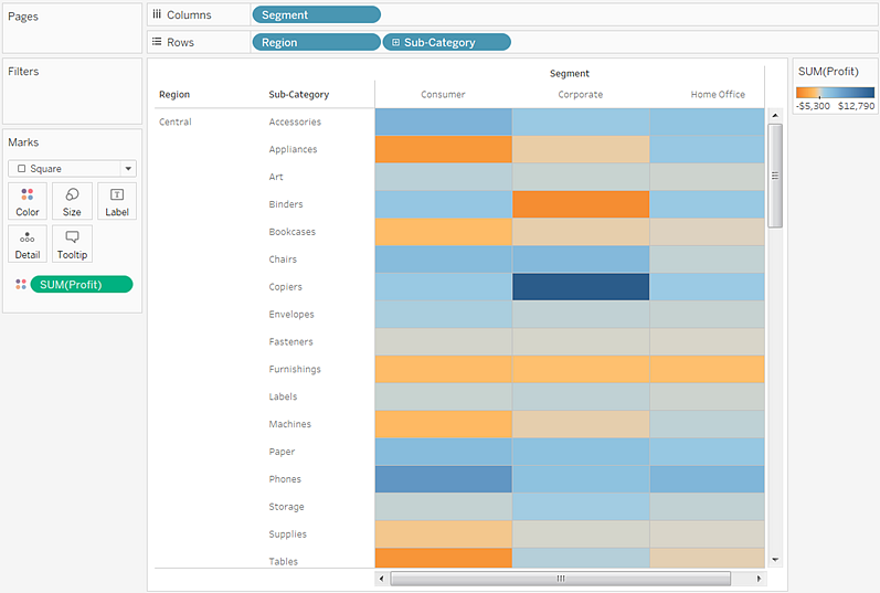
    Step 5 – Drag the Rank measure off of the Label shelf
    image
    You should now this view.
    image
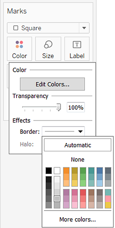
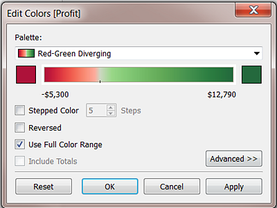
    Step 6 – Double click the color shelf to show the Edit Colors window.  Choose Orange from the Pallet list and the Reversed option, then click OK.
    image
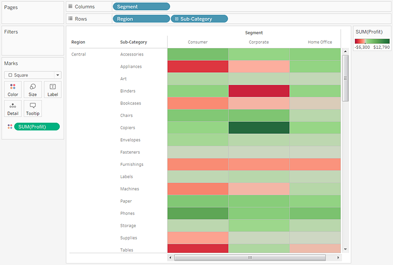
    You need to choose the reverse option if you want the highest ranking days to be the darkest.  You final view should look like this.
    image

4 comments:

  1. Great Blog. Very Impressive. Thanks for this wonderful share. I sincerely hope that your blog is a fast-growing traffic density, and to help promote your blog, we hope you blog updates and place can always be colorful.
    Plotting your own locations on a map in Tableau

    ReplyDelete
  2. I found your blog very interesting and very informative. I think your blog is great information source & I like your way of writing and explaining the topics.Tableau Server is an online solution for sharing, distributing, and collaborating on content created in Tableau. Tableau Server (Shareable) users can create workbooks and views, dashboards, and data sources in Tableau Desktop, and then publish this content to the server. For Further Queries About Tableau click here

    ReplyDelete